Making Your Images Glow Using the Orton Effect

The Orton Effect is a processing technique which helps make images “glow”. This technique is quite popular among landscape photographers. Although it was originally used in film processing, this is accomplished in Photoshop by combining a blurred image with the original (non-blurred) image and then applying some brightness and/or contrast adjustments.

I’ve seen different ways to get the same effect, but the version I prefer is one taught by Sean Bagshaw. It takes an extra step or two to set up, but then gives you more control. First, here are some images to show you what the Orton Effect looks like:

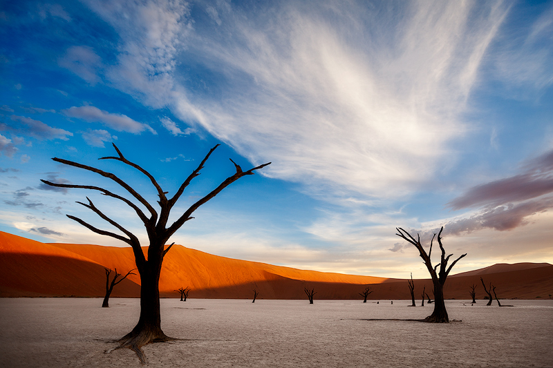
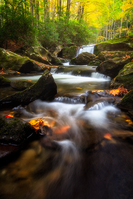
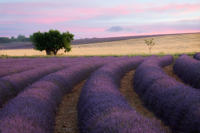
Image Without the Orton Effect

Lavender-No-Orton

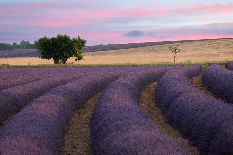
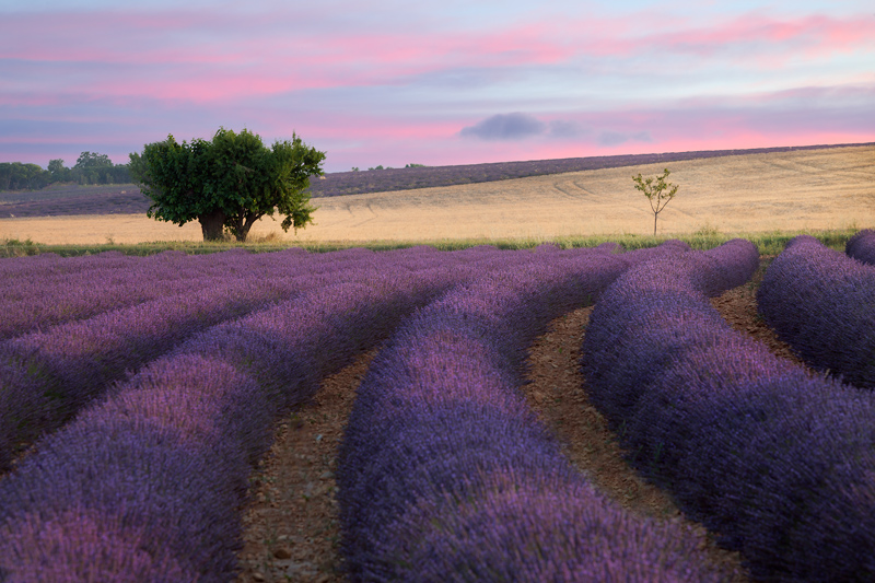
Full Orton Effect Applied to the Entire Image

This is too much Orton, but you can see the glow I am referring to. Notice that the sky goes white due to the increased brightness I used (more on that later) when the full effect is applied.

Lavender-100-Percent-Orton

Reduced Orton Effect Applied to the Entire Image

For this image below, I’ve reduced the effect to 30%, which is in the range I’d normally apply, but have left it applied to the entire image. The sky is still lighter than without the effect, which is undesirable.

Lavender-30-Percent-Orton

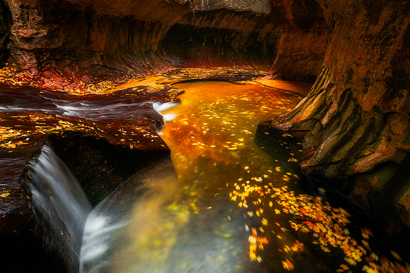
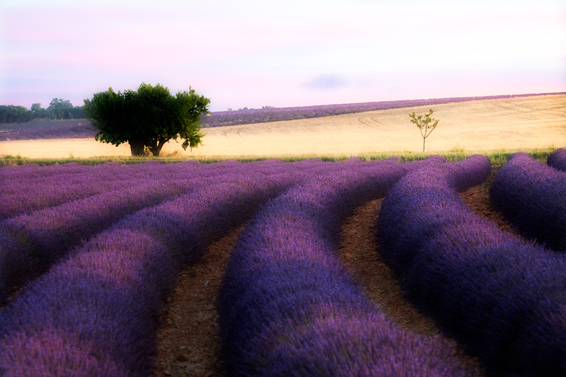
Orton Effect Applied Selectively

In this case, I’ve applied the effect moderately in selected parts of the image, namely the lavender, the distant yellow field and the right part of the larger tree which is getting sunlight.

Lavender-Selective-Orton

My opinion is that images look their best when the Orton Effect is applied selectively to only part of the image rather than the entire image. Here is how to create the effect in Photoshop (Note: I am assuming you have some basic knowledge of Photoshop here):

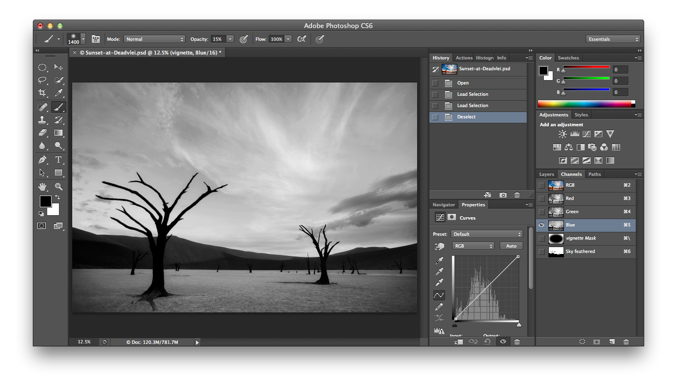
  • First, make a copy of the background layer (Layer – Duplicate Layer).
  • Second, create a new group folder by either clicking on the group folder icon or going to Layer – New –> Group. You can name the folder “Orton”. Move the copy of the background layer into the Orton folder.
  • Third, create two brightness/contrast adjustment layers in the Orton folder. Move one layer above the background layer copy and one below.
  • Fourth, select the top brightness/contrast layer and clip it to the background layer copy by doing a Control-Click (Mac) or Right-Click (Windows) on the brightness/contrast layer and choosing “Create Clipping Mask”. Change the blending mode to “Luminosity”. Then double-click on the left side of the layer to open up the adjustment panel. For now, increase the brightness to around 40 or so and decrease contrast to around -20 or so. You will adjust it later.
  • Fifth, select the bottom brightness contrast layer and double-click on the left side of the layer to open up the adjustment. For now, increase the brightness to around 40 or so and decrease contrast to around -20 or so. You will adjust it later.
  • Sixth, click on the background copy layer and choose “Filter-Blur-Gaussian Blur”. When the filter opens, you will have one value to adjust. Generally you don’t want the value too high or too low. I generally like the effect somewhere between 7 and 40 and usually between 10 and 15. Click okay and then change the blending mode of the layer to “Soft Light”.
  • Seventh, now that you have the full effect applied, it is time to make adjustments to the brightness/contrast layers. Double-click on the left side of each brightness/contrast adjustment and try modifying the adjustments to get the image looking more like you want, keeping in mind you will be lessening the overall effect. Sometimes, it looks good to apply increased contrast rather than decreased.

Now, there are two options:

  • Option 1: If you want to apply the effect to the entire image, then simply click on the Orton folder layer and reduce the opacity until it looks how you want it to. I usually settle on around 30% opacity.
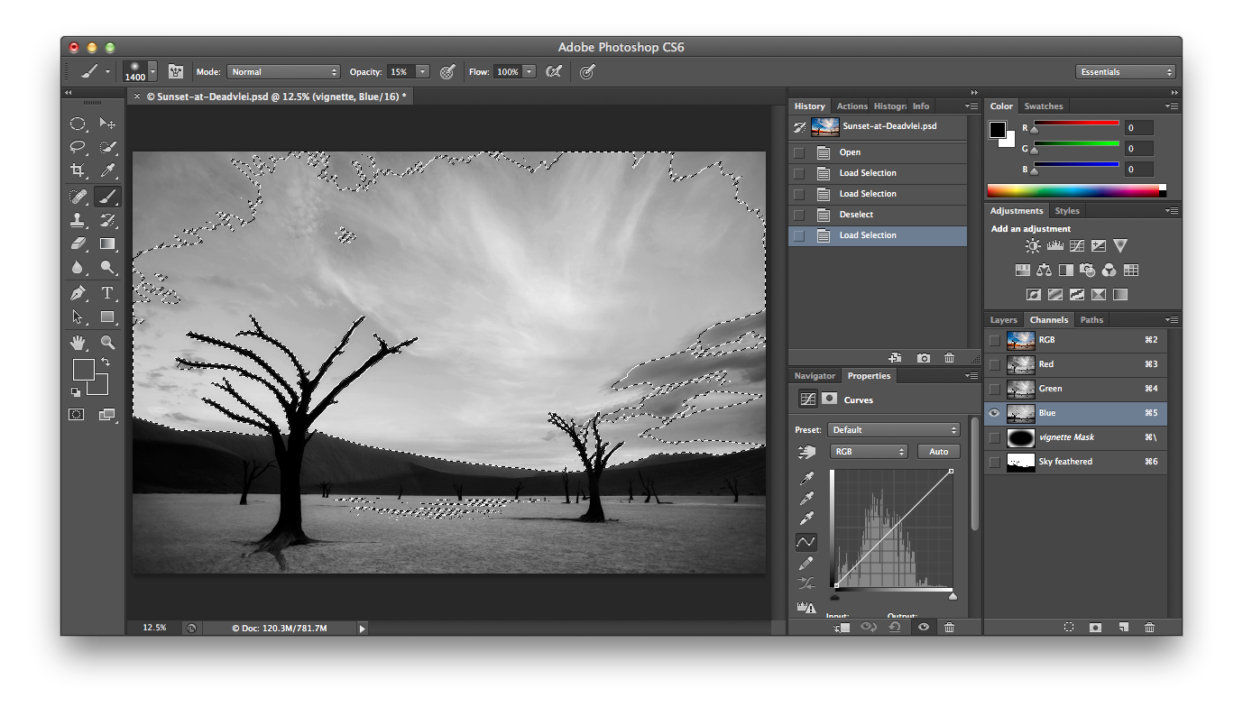
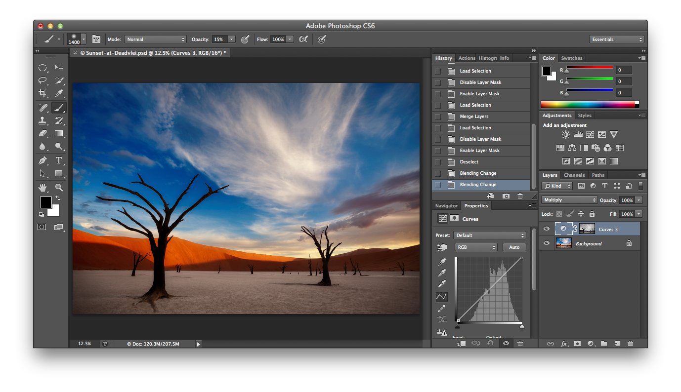
  • Option 2: If you want to apply the effect selectively (recommended), then Alt-Click on the “add layer mask” icon while the Orton folder layer is selected to add a black mask to the layer. Then select a soft brush using white as the foreground color and reduce the flow on the brush to around 15%. Paint white on the mask to build up the effect in the areas of the image that you want. In general, I find that having the distant elements of the image glow looks better. Also, you may want to retain the detail in certain parts of the image, such as a detailed foreground subject, so avoid painting the effect into those areas. I also usually avoid applying the effect to bright areas of the sky, as the Orton Effect (depending on your settings) will typically brighten that part of the image.

Adding Texture to an Image

Little things mean a lot in photography. Sometimes a minor modification to a photo can make a real difference. For the image below, I thought it wasn’t quite right. So, I sent it off to a mentor of mine… Indonesian photographer Rarindra Prakarsa… who always has great ideas and suggestions.

Rarindra suggested adding a texture to the white wall, which really made a difference in the image. Below is the before and after:

Before

Woman-With-Cool-Hair-No-Texture

After

america,beautiful,brunette,castaways,chicago,environmental portait,fashionable,female,il,illinois,midwest,north america,north ave beach,north avenue beach,portrait,scarf,united states,us,usa,woman

Love the Hair : Prints Available

Portrait of an elegant woman on North Avenue Beach in Chicago

In this blog, I’ll focus on the addition of the texture to the wall. This was actually the first time I’ve added a texture to an image. Here is what I did:

First, I had already taken pictures of textured walls. The one I used was from Venice. You can also buy texture images, but what’s the fun in that? When you take the picture, be sure to have the camera facing straight at the textured surface.

Second, I brought the textured image into the Photoshop file as a separate layer, placing it as the top layer. I added a mask to the texture layer to mask out everything except the white wall. Although a selection tool could also be used, in this case I just temporarily reduced the opacity of the texture layer (so that I could also see the image beneath it) and used a black paintbrush on the mask over everything but the wall.

Third, I changed the blending mode to “overlay”. You can also try different blending modes for a variety of effects, but “soft light” and “overlay” are good options.

Fourth (optional), I added a hue / saturation adjustment and clipped it to the texture layer. I then de-saturated the texture layer.

Fifth (also optional), I added a brightness / contrast adjustment layer and, in this case, reduced brightness and increased contrast a bit.

Sixth, and last, I adjusted the opacity of the texture layer down to around 45%. However, the amount should be based on your judgment of what looks good.

Opposites

We’ve all heard the saying “opposites attract”. Looking around, you could probably make a pretty compelling argument that the saying holds true. I mean, what else could possibly explain chocolate covered pretzels tasting good? I rest my case.

Good photographers know how to use opposites in a picture. By the way, I’ve deliberately used the term “opposites” rather than “contrast” because the latter is generally more narrowly defined in photography. You can build in opposites before, during and after the shot. Here are just a few of the many ways how:

Light and dark. Photography is all about lighting. Notice the shadows on the dunes below. I waited for what I considered to be the right balance of light and shadow on the dunes before taking this picture. It remains one of my favorite images. Without the shadows, the picture would have been much less dynamic.

africa,african,dead tree,deadvlei,desert,forest,horizontal,namibia,namibian,sand,tree,woods

End of Day at Deadvlei : Prints Available

Evening light striking the orange dunes at Deadvlei

Moving and Still. It is no secret that combining moving and stationary elements can make a photo more interesting. (See my other blog article on including movement in your images). Moving water, clouds, vehicle or people all work. You need to select the right shutter speed to blur the moving object (depends on a variety of factors, but initially think in ranges of 1/15 to 1/125). You also need to make sure your camera is stationary to keep the still objects sharp, given your shutter speed. So a tripod may be needed.

america,autumn,colors,fall,foliage,horizontal,leaf,leaves,left fork,left fork at north creek,left fork of north creek,north america,southwest,subway,swirling,the subway,united states,us,usa,utah,zion

Subway Gold : Prints Available

A flood in the Subway leaves the formerly turqoise pools filled with sand

Sharp and Blurred. Notice the eyes of the subject are sharp (and higher contrast) while the doorway is quite blurry (and lower contrast). This directs your attention to the eyes and away from the doorframe. During shooting, you can do this by selection of wider aperture or by positioning yourself closer to the subject and leaving more distance between the subject and the background. You can also create or accentuate this during post-processing.

asia,asian,environmental portait,indonesia,indonesian,jakarta,java,male,man,old,portrait,rumpin,smoking,west java

Smoke Break : Prints Available

Close-up portrait of Indonesian man smoking in the doorway to his home

Warm and Cool. Orange, yellow and red are considered warm colors. Blue is a cool color. A movement across your image of cool colors to warm colors can add dimension. This can occur naturally with low, angled sunlight. However, this is generally something you can do during post-processing. Just don’t get carried away. The image below starts cooler at the bottom and gets warmer towards the top.

creek,east,great smoky mountains national park,little river,middle prong trail,north america,tennessee,united states,water body

Little River in Autumn : Prints Available

Creek on Middle Prong Trail of Little River during Autumn.

Lastly, creatively including opposite concepts or characteristics in the image (fast and slow, old and new, etc) can work well for conceptual pictures.

Natural Looking Adjustments in Photoshop Using Channel Masking

We’ve all seen them… awful, unnatural looking transitions between foreground and sky or subject and background. Light “halos” at the edges which serve as indisputable evidence that you’ve Photoshopped the image. In most cases, quick selections resulting in hard-edged masks are the culprit. Feathering helps, but only so much.

I’ve gotten great results working with a technique called “channel masking” (a.k.a. luminosity masking). Using this technique, I can make natural looking adjustments without even touching a selection tool. This blog is a quick introduction to the technique (and nothing more) and assumes you have at least intermediate skills with Photoshop. The applications of channel masking are pretty extensive. With that in mind, let’s darken a sky.

We’ll start with the following image of Deadvlei in Namibia. I know this blog is not about Deadvlei, but I have to say it… Deadvlei is super cool.

africa,african,dead tree,deadvlei,desert,forest,horizontal,namibia,namibian,sand,tree,woods

End of Day at Deadvlei : Prints Available

Evening light striking the orange dunes at Deadvlei

For this image, I’m happy with the sky as it is, but let’s pretend I’m not. Let’s darken it. With the image open in Photoshop, click on the channels tab as seen in the lower right-hand corner. You’ll see the RGB channel as well as the individual red, green and blue channels.

Screen Shot 2013-03-05 at 7.00.45 PM

You’ll notice I’ve clicked on the blue channel which is now active. The blue areas of the image are lighter in tone, indicating that blue is stronger in the blue channel (imagine that!). The color blue is weaker in the darker areas of the channel. If the red channel was selected, the dunes will appear lighter. Let’s stay with the blue channel because we are darkening the blue sky.

You will recall that, with masks, the lighter areas are more affected than darker areas when making an adjustment. We are going to turn this amazingly detailed channel into a mask that you could never create using any brush or selection tool in Photoshop. To do that, hold down Command (Mac) or Control (Windows) and click on the blue channel layer. The “marching ants” appear around the 50% brightest pixels in the image, as in the following screenshot:

Screen Shot 2013-03-05 at 7.02.33 PM

Now, in this example, I will just keep the 50% brightest pixels selected for my adjustment. However, if you hold Command-Alt-Shift (Mac) or Control-Alt-Shift (Windows) and click again on the blue channel, you will cut the % in half each time you click (1st click means 25% brightest pixels, next click 12.5%, etc). The more times you click, the more your adjustment will be limited to the lightest pixels in the image as they appear in the blue channel.

After your selection is created, click on the layers pallet and create a curves adjustment layer. (We won’t actually be modifying the curve here). Change the blending mode to Multiply to darken the image by one stop. The light areas of the mask are darkened most in the image and dark areas the least. Below is the result, which you can compare to the first image in the blog. Notice the sky is darkened, but the rest of the image is not as affected. No ugly halos. Perfect transitions. You can now adjust the opacity to control the amount of darkening.

Screen Shot 2013-03-05 at 7.07.07 PM

For more control, you can create a new folder with a mask and drop the adjustment layer in that folder. Then, paint on the folder mask to limit the adjustment to the lighter areas of the folder mask. With this image, it would be easy to paint gray or black over the ground to limit or eliminate any adjustment to that part of the image. Also, keep in mind that darkening the selection is not the only option here. You can lighten, add saturation or make other adjustments.

Again, that is just a very brief introduction to the technique. If you want more info on channel masking, you’ll want to learn from a real master. I’d recommend checking out Sean Bagshaw’s video series “Extending Dynamic Range” or “The Complete Guide to Luminosity Masks”.

Backing Up Your Photos

Losing all of my photos from a trip or, worse yet, ALL of my images is completely unthinkable. In fact, I better just stop thinking about that now and move on to the steps I take to prevent it from happening. Here is my strategy for back-up while traveling and long-term.

First, while traveling:

I buy decent cards (not the best, but definitely not the cheapest) and make sure I have enough card capacity for the trip. I shoot a lot of pictures and in RAW format, so I have about 120 gigs of card space which is usually barely enough. I don’t have extremely high capacity cards because I wouldn’t want to lose half my pictures if one of the cards went bad (and they are known to get corrupted sometimes). I have 6 cards at the moment.

At the end of every shooting day, I back up the day’s images onto my laptop and also import them onto the portable hard drive which I use for my Adobe Lightroom library. I do not erase the pictures off the cards. So, I carry three copies: 1) the originals on the cards; 2) the files on the laptop; 3) the imported files on the portable drive, which become my “original” files and which I can start keywording or processing. I never leave all three together alone. If I leave the hotel and head to dinner, I take either my cards or my computer with me and leave the others locked up in the safe in my room or hidden.

When the trip is over, I immediately back up my images to my long-term backup drives. I leave the copies on my cards and laptop drive as well until I have backed everything up to those drives. Then I delete the files off the cards and laptop.

Next, my long-term back-up strategy:

I am not at all comfortable having just two copies of my images:

As mentioned, I use a portable hard drive as my main (Lightroom) drive. Some people don’t advocate the portable drive, but I do a lot of processing away from home and prefer a portable drive for my original images.

Second, I have a good quality external hard drive as my main backup drive. This has all my images on it, including the RAW files, Photoshop files, etc. I do not recommend buying a cheap hard drive as your main backup drive, as two years ago I bought three cheap ones (the same brand) and had two crashes within a month.

I have another back-up drive (so 3 drives total) at a friend’s house inside a fireproof safe. He lives a bit farther away, so the same tornado couldn’t hit both of us.

Doing all of this allows me to get good sleep at night.

High Contrast Cathedral Images Using HDR

Some time ago, I was in San Francisco and stopped at St. Ignatius church. This is a really beautiful church and was fun to shoot.

HDR,america,building,california,cathedral,church,city scape,cityscape,horizontal,ignatius,north america,saint ignatius church,san francisco,st. ignatius,united stat

St. Ignatius : Prints Available

HDR rendition of the interior of St. Ignatius Church in San Francisco

Here are my recommendations on how to get this type of indoor church or cathedral shot using high dynamic range (HDR) processing:

– You’ll definitely need a tripod. It’s a good idea to call ahead and get permission to use it indoors.
– Generally, you’ll want to use a very wide angle lens. I used Canon’s 14mm with a full frame sensor for this shot.
– Shoot with a lot of depth of field. I used F22, since I wanted everything in focus, including the pews in the foreground and the columns in the background.
– Use HDR, or High Dynamic Range processing. There are books written about HDR, but the basic idea is to shoot multiple exposures and then use software to blend the exposures so that everything is exposed reasonably well. This is helpful in churches because the lighting contrast is so extreme. HDR photos do have an artificial look to them which you may or may not like.
– Important! Pay very close attention to your position. If you are trying to shoot straight on, such as in this shot, look at the corners and lines to make sure everything lines up. I was close, but not perfect, on this shot. With an ultra-wide lens, even a few inches to one side or a very slight tilt of the camera will distort the perspective. In this case, I wanted the same amount of column on each side of the image and the lines on the ceiling to be as straight as possible. I watched the corners and edges of the frame closely while setting up the composition.
– Use the manual setting on the camera. After setting your aperature, adust the shutter speed until you have a good exposure for the brightest part of the image, most likely the stained glass windows. Make sure they have good color and are exposed well. The rest of the picture will be really dark. Then, take subsequent shots while decreasing the shutter speed to allow more light. I do this in 2/3s of a stop increments. Make sure not to move the tripod between shots. When the darkest part of the image is exposed properly, you are done shooting that composition. The windows will be completely blown out, but the shadows should be exposed properly.
– After you are finished shooting, use HDR software to blend the pictures. Photoshop has HDR, although there are other options. I use Nik Filters’ HDR software and like the results I get better than with Photoshop. Photomatix is a very popular option. Even if you don’t have this software now, take the multiple exposures and you can process them later if/when you get the software.
– If you process in Photoshop or use filters, try increasing the contrast and enhancing the color a bit. I used Nik Filters “Pro Contrast” and “Brilliance/Warmth” filters for this shot.