Okay, I admit it. The title to this blog sounds pretty boring. However, this is pretty important stuff. Apart from getting a compelling composition in camera, controlling tonal contrast during post-processing is perhaps the most important part of creating a successful image. So, read on!
First, what does tonal contrast mean from a photography perspective? It is simply the magnitude of the difference between the light and dark areas of the image. To see this visually, let’s look at the histogram… a tool found in your post-processing software that can help you control contrast more effectively. In Adobe Lightroom, you can make the histogram visible by making sure the word Histogram is checked under the Window menu. Whatever software you use, it should have the option to view a histogram.
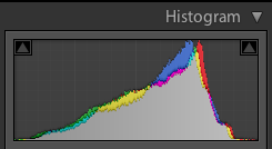
Identical tones in your image are reflected in the vertical movement of the graph, while differences in tones are reflected in the left to right movement. An overall darker image results in a histogram concentrated on the left, while a lighter image results in concentration on the right. The following should make this clear…
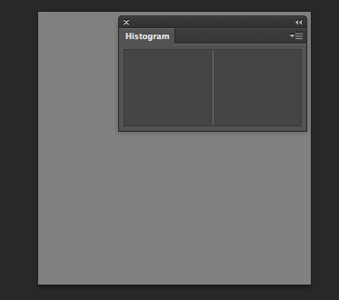
The image below is just a gray box. Every pixel is filled with the same tone… middle gray, which is exactly halfway between pure black and pure white. This zero contrast image results in a histogram that is made up of a single column right in the middle.
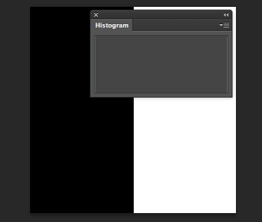
Now, look at the next image. As expected, the histogram has two columns at the edges… the left representing the black pixels and the right representing the white pixels. All of the pixels are concentrated in two tones.
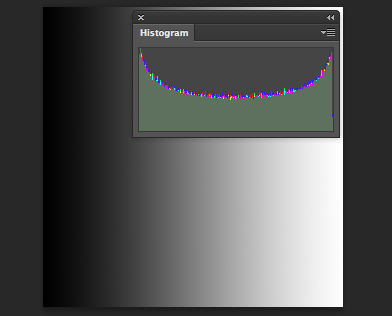
Lastly, here is an image with a gradient applied from pure black to pure white. You can see what the histogram looks like in this case, with a full range of tones.
So, how do I actually control contrast and how do I use the histogram when processing an image? Although I work with contrast at different stages in post-processing, I initially adjust contrast as one of the first steps, right after white balance and exposure if needed. I will focus here on this initial contrast adjustment using a landscape image as an example.
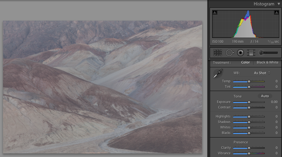
The image below is a pretty extreme example of one that completely lacks contrast and looks “gray” in tone. The histogram is concentrated around the middle. This image can be substantially improved by increasing contrast.
Below is the same image after a quick contrast adjustment. This image is not finished with processing, but it certainly looks a lot better already. The histogram shows greater left to right movement. Each side of the graph does not quite reach the edge. I do this because I like to leave myself some room for a later contrast adjustment in Photoshop.
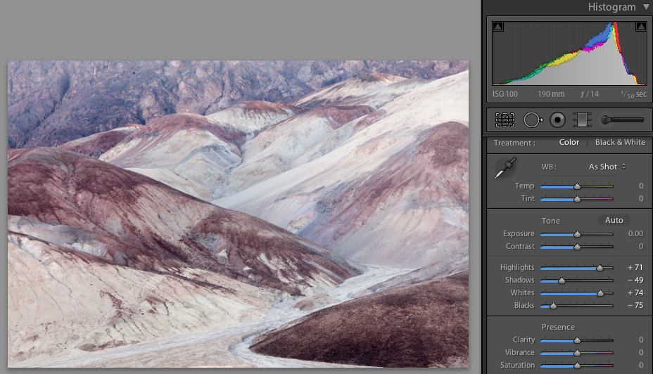
In the partial screenshot above, you can see the adjustments I made using the sliders in Lightroom. Other software should have similar sliders. Again, this is a pretty extreme example, so my adjustments are pretty extreme here. There is no real right way to do this, but here is what I did for this image:
First, looking at the histogram, I moved the Blacks slider to the left to get the leftmost part of the graph line fairly close to the edge, but not touching. So, there is no pure black in this image. If this image had pure black from the start, I may have moved the slider to the right to reduce the pure black in the image.
Next, I looked at the darker parts of the image (ignoring the histogram) and adjusted the Shadows slider so that the image had greater contrast, but without losing detail in shadow areas. You usually want to still be able to see detail in at least some of the shadows.
Third, looking at the histogram, I moved the whites slider to the right until the graph line was close to the edge, but had room to spare. If the image didn’t look good with that adjustment, I could have simply backed off on the adjustment. Also, if the graph was up against the right side at the beginning and I didn’t want pure white in the image, I would have moved it left to reduce or eliminate the pure white cells.
Fourth, looking at the image, I adjusted the highlights slider until the image looked good and the lighter areas of the image showed some nice contrast.
Fifth, I went back and tweaked the sliders again.
It is important to note that this is really only an example of how I initially adjusted contrast for one particular image. In many cases, you want to reduce contrast, rather than increase contrast. For some images, it is okay or desirable to have a fair amount of pure black and/or pure white in the image. In some cases, you want your image histogram concentrated to the left, middle or right. An image of a night sky will likely have a histogram that shows a lot of dark tones and pure black.
So, the above doesn’t apply in all cases. But, hopefully this exercise is helpful to you. Most importantly, be sure to balance what you see in the histogram with what looks good to your eyes.