I Love Ultra Wide Angle Lenses

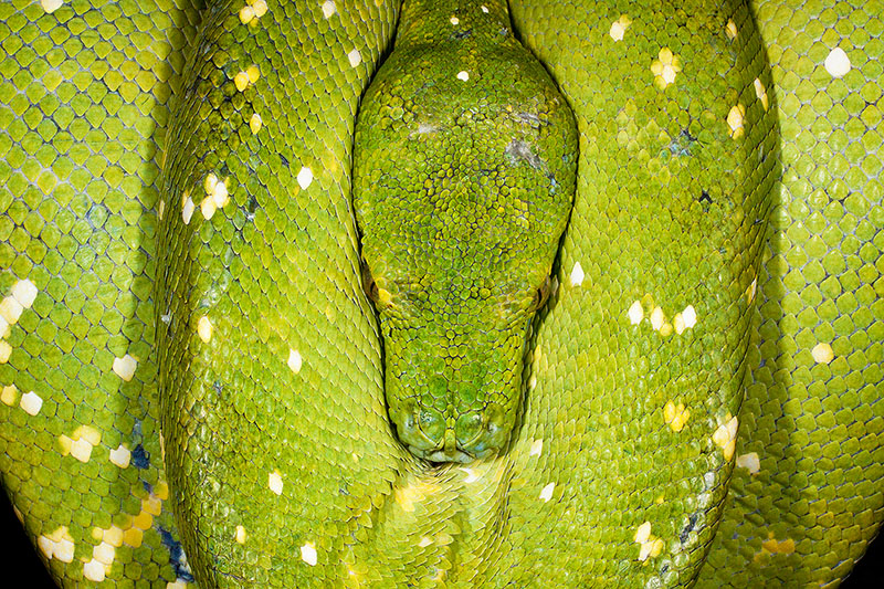
I love wide-angle lenses. I love them so much that I need to say it again. I LOVE wide-angle lenses.

When I refer to my love for wide-angle lenses (I really love these lenses), I am mostly talking about the widest lenses, also known as ultra-wides. Without getting too technical (because I can’t), these are lenses in the 14mm-16mm range for those of you who have full frame sensors (you know who you are). For cropped sensors, the 10mm range is the upper end of ultra-wide. These are different from fish-eye lenses, because ultra-wides keep the lines straight while fisheyes curve the lines. Don’t know what I’m talking about? That’s okay… read on as the same principles apply (somewhat) to wide-angle lenses in general.

I’ll start with the most important thing I have to say about wide-angles. Do NOT just use these lenses for jamming as much as possible into the picture. In fact, this usually doesn’t look good.

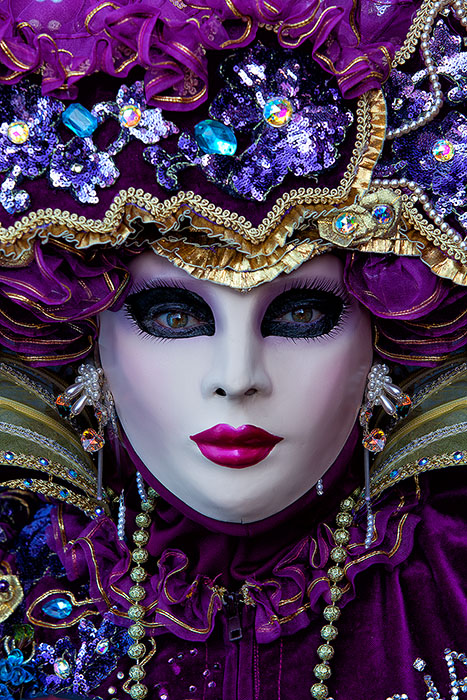
There are three things that I like about ultra wides. First, these lenses exaggerate the distance between the foreground and background. Objects that are far away look smaller than they really are while closer objects look larger. Getting close to a foreground subject makes the subject more prominent in the frame. Below is an example. I was shooting somewhat close to the model… probably 12-16 inches away from her left hand. The model’s dress and hand look large… like they have been pulled towards the camera. The building feels farther away than it was.

carnival, celebration, close-up, colorful, costume, europe, horizontal, italy, macro, mask, party, venice

Blue Angel : Prints Available

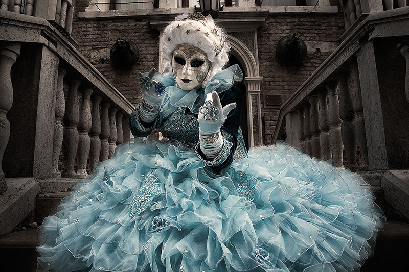
Blue costumed Carnival model calling from a stairway in Venice

Here is another shot from Venice which further illustrates this. The distance between foreground and background has been greatly exaggerated.

carnival, celebration, colorful, costume, europe, italy, mask, myriam, myriam melhem, palace, party, red, staircase, stairs, stairway, stairwell, venice, vertical

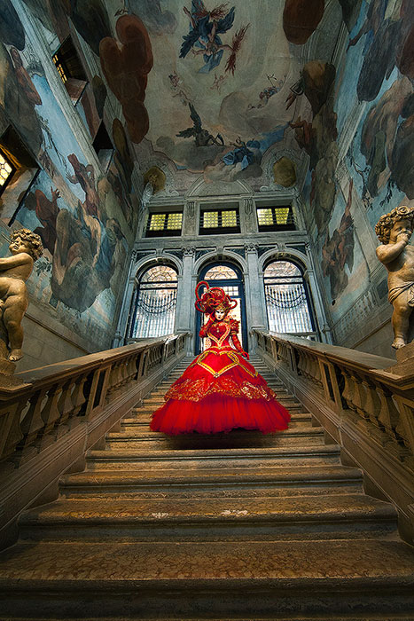
Ornate Staircase : Prints Available

Carnival model in red walking down a beautifully painted staircase

Second, ultra wides make the corners look stretched out. Check out the lower right corner of this picture shot with my 14mm lens and compare it to the center of the frame and the building in the distance. This stretching of the corners adds a lot of dimension to this image. One challenge in taking this shot was keeping myself out of the reflection in the sign.

333,america,building,chicago,city scape,cityscape,green,horizontal,il,illinois,midwest,north america,skyscaper,united states,urban,us,usa,wacker,w

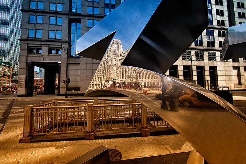
Reflection on Wacker Drive : Prints Available

Color rendition of a reflection in a sign on Wacker Drive

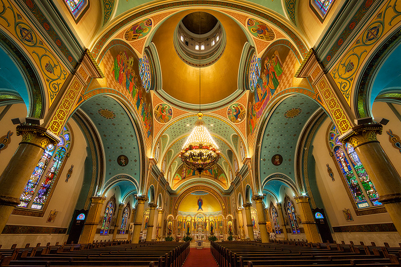
Third, yes, sometimes wide angles are helpful for jamming everything into the picture. Cathedral shots are an example. I could not have gotten this entire shot in without an ultra wide lens.

carnival, cathedral, celebration, colorful, costume, europe, horizontal, italy, mask, party, saint mark's basilica, san marco, st. mark's basilica, venice

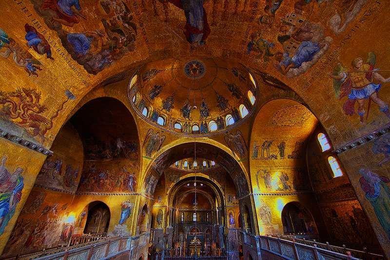
St. Mark's Basilica Interior : Prints Available

St. Mark’s Basilica in San Marco square

Here is some advice on using ultra-wides (and wide angles in general):

First, do not be shy about getting very close to your subject. Walk up to and around your subject while looking in the viewfinder and you will see how moving forward or back just inches can dramatically change your composition. This will also make you look cool to those around you. Just don’t trip on anything while looking through your viewfinder. Not that I’ve done that. I’m just saying.

Second, pay extra careful attention to the background. There is more background to worry about. It is much easier to inadvertently include unwanted elements. It is also more challenging to position yourself just right in order to get corners and lines where you want them. An example of where I blew this is the stairway shot earlier in this article. Notice the ceiling isn’t straight. I was positioned slightly off-center.

Third, and last, start without a tripod. Even if you will actually shoot with a tripod, start by walking around and determining your position first.

Using Leading Lines to Draw Attention to the Subject

I generally try to avoid saying things that sound corny. But I’m going to make an exception here. Okay, so here goes… ahem…. “good photographic composition should take the viewer on a visual journey through an image and arrive decisively at the subject of the photograph.” Okay, yes, that is super corny sounding, but you should not view me as being a writer of corny blogs since I recognized the statement was corny and warned you ahead of time.

So, now that the corniness is out on the table, let me explain what I mean. If you look around an image and your eyes don’t know where to land, then it is usually compositionally unpleasing. Why? Heck, I don’t know, but smart people have done studies on this. A good compositional technique is to get your viewer’s eyes to move around the image (this takes a fraction of a second) and land on the subject. How do you do this? One way is through “leading lines”, the topic of this blog.

You can use lines within your composition to direct the viewer’s attention to the subject. In the picture below, the retreating waves make lines which move your eye through the image until arriving at the cape in the distance.

beautiful,cape kiwanda,clouds,coast,coastal,horizontal,morning,north america,northwest,ocean,oregon,pacific northwest,pacific ocean,rushing,sunset,united states,water body,wave

Morning at Cape Kiwanda : Prints Available

Retreating water forms a leading line to Cape Kiwanda

In this next image, the wooden posts in the water make a line which brings your attention to the Chicago skyline. Note that straight lines in images don’t always work. In scenes with man-made structures (such as this one), you expect to see straight lines, whereas you generally expect more curved lines in nature.

america,beautiful,chicago,city scape,cityscape,horizontal,il,illinois,lake michigan,midwest,north america,red,sunrise,united states,us,usa

Chicago Sunrise : Prints Available

Beautiful red sunrise over Lake Michigan

The winding fence makes a perfect leading line up to the barns of Jenne Farm. Jenne Farm is the most photographed farm in the U.S. and for good reason… it’s a very beautiful place to spend a morning in Autumn.

america,autumn,barn,building,colors,east,eastern,fall,farm,foliage,horizontal,jenne farm,new england,north america,reading,united states,us,usa,vermont

Jenne Farm in Autumn : Prints Available

Morning light and Fall foliage at the Jenne Farm

The path below brings your attention to the hikers in the distance who would otherwise be lost in the image.

center,central,europe,geothermal,horizontal,hveravellir,iceland,interior

Three Hikers : Prints Available

Path forms a leading line to hikers in the distance

The “Rule of Thirds” – Part 2 – Breaking the Rule

This is the 2nd part of a 2-part blog on the “rule of thirds”. Part 1 focused on demonstrating what the rule is and how to follow it. If you haven’t read Part 1 yet, you should probably read that first. Part 2 focuses on breaking the rule.

I should start out by saying that the rule of thirds is a good guideline which more often than not results in a better overall image. However, sometimes breaking the rule is a good thing. This blog is going to focus specifically on the #1 reason I break the rule… that is to create or take advantage of symmetry in a composition.

For example, in the following image of the Green Tree Python, I placed the snake’s head dead center. This goes against the rule of thirds, but works well because of the symmetry of the snake. If I had placed the snake’s head at one of the four intersections of the rule of thirds grid (see Part 1), the image would not have been as strong.

coiled,frog and reptile,frog reptile,green,green tree python,horizontal,jim zuckerman,morelia viridis,night,python,reptile,snake,symmetrical,workshop

Symmetry : Prints Available

Perfectly symmetrical sleeping Green Tree Python

Close-up portraits where the subject is looking straight at the camera generally look better composed dead center. I really like the composition in the Carnivale model portrait below because of the symmetry in the mask and costume.

burano, burano island, carnival, celebration, close-up, colorful, costume, europe, italy, macro, mask, party, portrait, purple, venice, vertical

Elegance : Prints Available

Close-up portrait of a gorgeous Carnival model in a bright purple costume

The same applies to the cathedral shot below, which works well because of the perfect symmetry of the cathedral. I could have composed this shot with the top of the church pews 1/3 from the bottom of the image. However, the church pews are much less interesting than the beautiful walls and ceiling, so I opted to de-emphasize the pews by keeping them at the very bottom of the image.

building,cathedral,chicago,church,illinois,midwest,nicholas ukrainian cathedral,north america,united states, saint nicholas, st nicholas, catholic

Saint Nicholas Cathedral : Prints Available

Interior shot of Chicago’s own Saint Nicholas Ukrainian Catholic Cathedral.

Combining symmetry with a slightly off-center subject can work very well as a composition. Notice the foreground below is mostly symmetrical, while the sea stack (the main subject) is composed slightly off-center. The sea stack is not quite at the top right rule of thirds intersection. The symmetry of the foreground holds the image together, while the slightly off-center sea stack really draws your eye in this case.

beach,cloudy,coast,coastal,crashing,evening,north america,northwest,ocean,pacific northwest,pacific ocean,rialto beach,sea stack,shore,sunset,united states,vertical,washington,water body,wave

End of Day at Rialto Beach : Prints Available

A beautiful sunset on the shores of Rialto Beach

Look for opportunities to create symmetry in your photos and don’t hesitate to break the rule of thirds in those cases.

If you would like to read more about the rule of thirds, you can also check out the following article at Photography Talk:

https://www.photographytalk.com/beginner-photography-tips/7148-the-rule-of-thirds

The “Rule of Thirds” – Part 1 – Following the Rule

Welcome to Part 1 of a 2-part blog on the “rule of thirds”. The rule of thirds is perhaps the most well-known guideline in art and photographic composition. Part 1 focuses on creating images that follow the rule. For you rebels out there, Part 2 focuses on breaking the rule. So, there is something for everyone in this blog.

First, what is the “rule of thirds”? Let’s start with what it is not. Take a look at the image below. This is your typical awful, boring vacation snapshot that your college roommate just brought back from a weekend trip to Chicago. Only it is not just this one picture… your roommate has seven of the same shot and you need to look at all of them. Notice how the subject is dead center (left to right), the horizon line is very close to the bottom (and crooked) and there is too much sky in the picture. The picture just looks off-balance and compositionally boring. This picture is a snapshot and does NOT follow the rule of thirds.

Lighthouse

Now, take a look at this next image of a fisherman I shot in Guilin, China.

asia,china,chinese,cormorant,fish,fisherman,guilin,horizontal,household,lamp,lantern,li river,morning,river,yellow cloth shoal

Morning on the Li : Prints Available

Chinese fisherman silhouette on the Li River

Notice that this image really works compositionally. This one doesn’t look like your roommate’s vacation snapshot. One reason this picture works so well is because it follows the rule of thirds. Now, I haven’t forgotten that I still haven’t really told you what the rule is. So, let’s do that now. Let me take this same image and put a “tic-tac-toe” grid over it using two horizontal and two vertical lines, each 1/3 of the way into the scene.

Morning on the Li

To follow the rule of thirds, you place “points of interest” (the subject, horizon lines, etc) 1/3 of the way into the image, using both the lines and the intersections of the lines to guide you. You would often place your subject (or a key part of your subject) at one of the intersections and also use the lines themselves for important parts of the picture. In the image above, I placed the fisherman at the lower right intersection, while the horizon line and mountains are generally along the top line.

So, how do you know which line(s) and intersection(s) to place your subject and points of interest at or along? Good question! Remember, photography is more about what works as opposed to following rules. However, here are three guidelines to consider:

  • If your subject is moving, you usually want them moving into the image rather than out of it. Notice my placement of the fisherman on the right of the above image means he is moving into the composition. Placing him at the lower left intersection would have looked awkward… like he is moving right out of the image.
  • Similarly, if your subject is someone or something with eyes and is looking left or right, you generally want them looking into the picture, not out of the picture. In the image below, the woman on the left is looking into the image which works well. I’ve also placed the two women along each of the vertical lines. I’ve placed the main subject (the face of the woman on the right) at the top right intersection.
asia,china,chinese,doorway,elderly,female,friendly,horizontal,old,older,portrait,sitting,staircase,stairs,stairway,stairwell,structure parts,woman

Friendship : Prints Available

Older Chinese women sitting on the stairs

  • You typically want the most important part of the picture to take more space. This factors into a decision on where to put the horizon line in a landscape photo. Placing the horizon on the bottom line would generally result in about 2/3’s of the image being sky. This might work if you want to emphasize the sky. However, you may not want to short-change the main subject of the image… the landscape foreground. In the image below, I placed the horizon along the top horizontal line because I wanted more emphasis on the lavender fields than the sky. Notice the tree (the subject) is at the top left intersection.
europe,france,horizontal,lavender,purple,southern,tree,valensole

Leading Lines : Prints Available

Late evening light strikes a tree in the middle of a lavender field

There is more to say on the rule of thirds. However, hopefully this helps with an introduction to what the rule is and how to follow it. In Part 2, I’ll show you that it is often a good idea to break the rule.

Also, if you would like to read more about the rule of thirds, you can also check out the following article at Photography Talk:

https://www.photographytalk.com/beginner-photography-tips/7148-the-rule-of-thirds